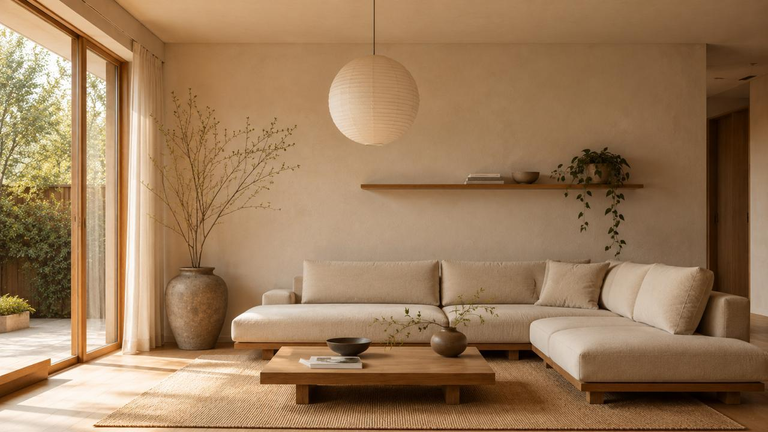
15 Living Room Color Combination Ideas
Ever bring home a paint sample that looks perfect at the store, then turns suspiciously purple next to your sofa? The easiest way to choose living room colors is to start with something you already love. These 15 living room color combination ideas show how to build around your furniture, flooring, and natural light.
My favorite starting point is a rug with at least two colors in it. Pull one shade for the walls and repeat another in a pillow or chair. If your rug is plain, use a favorite print or even the upholstery as your starting point.
Warm Neutral Living Room Color Schemes
1. Warm White and Light Oak for a Room That Glows
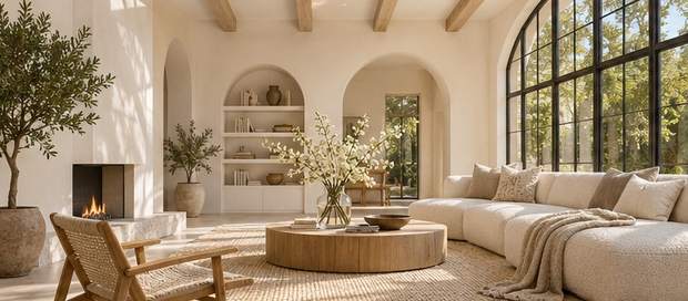
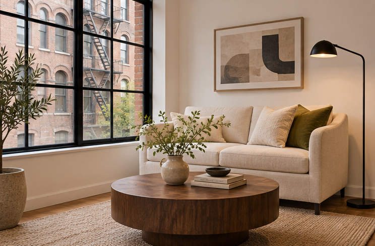
If your white walls feel flat, try a creamy white with a hint of warmth. Light oak brings out that warmth, especially when you repeat it in a coffee table and an open shelf. Give the sofa some texture with a chunky throw or a pair of linen pillows.
Want a little more depth? Hang artwork in a darker wood frame. That small change gives your eye somewhere to land without interrupting the pale palette.
2. Greige and Charcoal for Cozy Contrast
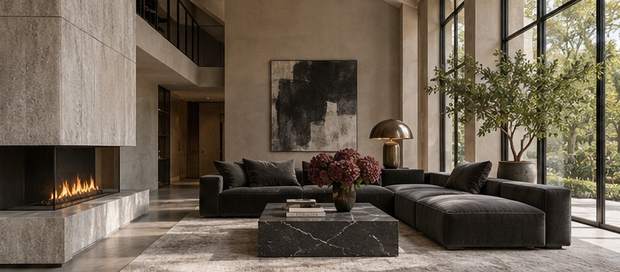
Greige sits between gray and beige, so it’s a handy pick when you already own a gray sofa and warm wood furniture. Try it on the walls and bring charcoal into the room through a reading chair, lampshade, or sectional. Keep the rug a shade lighter than the walls to lift the seating area.
Compare a few samples beside your biggest piece of furniture. A cool greige can pull purple next to golden oak, while a warmer one can echo its honey tones.
3. Sand and Cognac for an Easy Desert Look
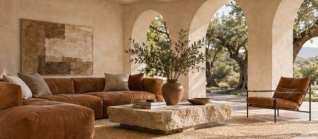
Think sandy walls, a cognac leather sofa, and a big woven rug. The two main shades share a warm undertone, so the room feels pulled together even if you bought the pieces years apart. Add a dark walnut table for contrast.
Love the look but working with a fabric sofa? Try a cognac throw and caramel-colored pillows in two different textures. A little leather on a tray handle or stool can tie the pieces together.
Earthy Green Palettes That Feel Like Home
4. Sage Green and Ivory for a Calm Corner
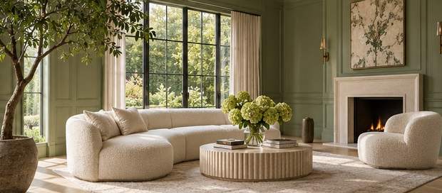
Paint the walls soft sage and let ivory curtains or a slipcovered sofa lighten the view. This wall color combination works beautifully with pale oak and rattan because the materials echo the muted green. Add a single striped pillow if you want some pattern.
Does the room get very little daylight? Compare a gray sage with a slightly yellower sample. The warmer version may keep more of its green once the sun goes down.
5. Olive Green and Terracotta for Warm, Earthy Style
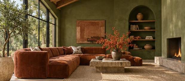
Olive walls give a plain living room the feeling of an old house with character. Add terracotta in a clay lamp, a woven blanket, or a low upholstered chair. Use natural linen at the windows to break up the deeper colors.
FYI, terracotta pieces can range from dusty pink to burnt orange. Group your favorites together before you buy more. If you spot a shade you love, repeat it once on the opposite side of the room.
6. Forest Green and Camel for a Reading-Room Feel
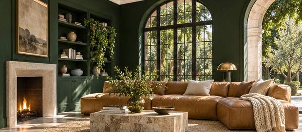
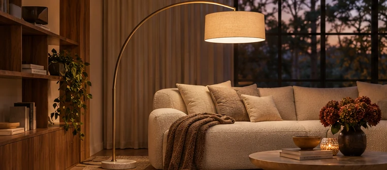
Pair forest green walls with a camel sofa for a living room that feels especially inviting after dark. The warm upholstery looks richer against the deep green. A shaded floor lamp beside the sofa makes this a natural spot for reading.
Prefer to start small? Paint a bookcase or the wall behind it in forest green and keep the surrounding walls warm white. Then carry camel through a footstool or a soft blanket.
Blue Living Room Colors From Soft to Bold
7. Navy and Soft White for a Crisp, Classic Look
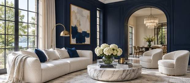
Navy feels timeless when you pair it with soft white and warm wood. Paint the main wall navy, then give the color some breathing room with white curtains or light upholstery. A walnut coffee table adds warmth between those two strong colors.
What if you love a coastal look without the beach-house theme? Pick wide blue stripes and simple ceramic pieces. Repeat navy on one cushion to connect the sofa with the painted wall.
8. Dusty Blue and Warm Beige for a Softer Coastal Room
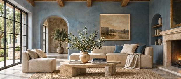
A dusty blue wall gives a beige sofa a fresh backdrop. Choose a blue with a little gray in it, then warm it up with oatmeal curtains and a woven rug. This is an easy palette to build around a sofa you already own.
Try a patterned pillow that has both colors in it. That one piece can connect the walls and upholstery. If the floor is honey oak, bring a touch of that wood tone into a picture frame.
9. Teal and Mustard for a Playful Midcentury Look
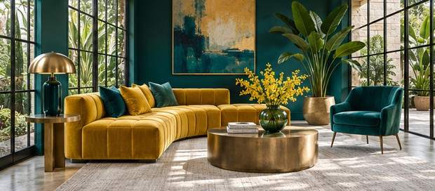
Teal and mustard give a living room energy without asking for much extra decor. Use deep teal behind a mustard chair and add a warm wood sideboard or a round coffee table. Keep the curtains simple so the two colors can stand out.
Already have a teal sofa? Keep the walls creamy and repeat mustard in a cushion and a small art print. Those accents are easy to move if you decide the room needs more yellow.
Unexpected Color Pairings With Personality
10. Burgundy and Blush for a Rich, Rosy Room
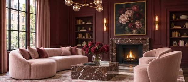
A burgundy wall gives blush upholstery a grown-up feel. Choose a dusty blush for curtains or a chair, and mix in cream on a rug to keep the palette from feeling heavy. A little aged brass looks lovely here, especially around a lamp or mirror.
Curious about using burgundy in a small space? Try it behind the sofa first. Sit across the room in the evening and see how the wall looks under your usual lamps.
11. Eggplant and Taupe for Subtle Drama
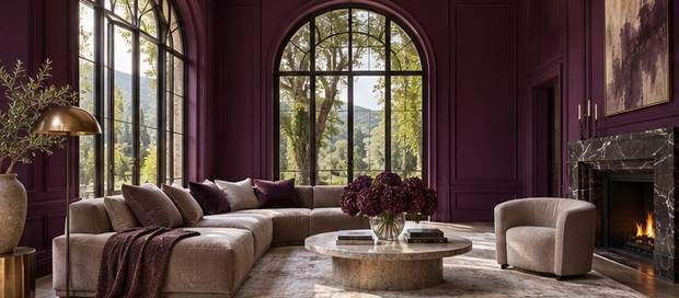
If purple sounds tricky, start with eggplant. This muted shade looks surprisingly natural next to mushroom taupe, dark wood, and warm metal. A taupe sofa or rug softens the walls while keeping the room cozy.
Bring home a few taupe fabric samples before committing to paint. Some lean pink, while others read gray or brown. Choose the one you like against the eggplant in daylight and under a lamp.
12. Rust and Cream for an Instant Warm-Up
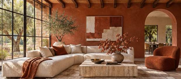
Rust gives cream upholstery a strong backdrop and makes a room feel warmer the moment you walk in. Use burnt orange on the wall with the fireplace or sofa, then repeat it in a pillow or small ceramic piece. A large cream rug keeps the floor bright.
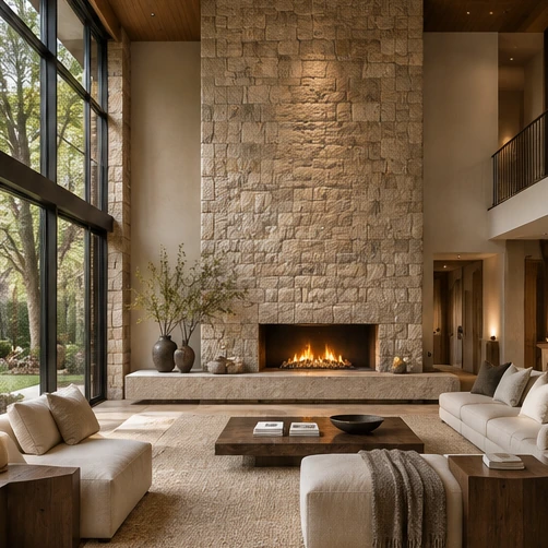
Got a brick fireplace already? Pull a rusty tone from the brick and test it nearby. You might find the fireplace does most of the color work on its own.
13. Chocolate Brown and Pale Blue for an Unexpected Pair
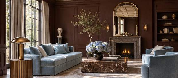
Chocolate brown makes pale blue look clear and crisp. Try the brown on a paneled wall and add blue in a chair or cushions, then bring in ivory to keep the room open. Dark walnut furniture works especially well with this palette.
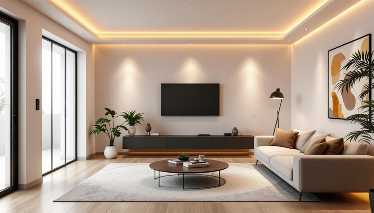
If brown paint feels like a big jump, start with a dark wood media unit or chocolate sofa. Carry pale blue through the room with curtains and a small piece of artwork.
14. Ochre and Deep Olive for a Vintage Mood
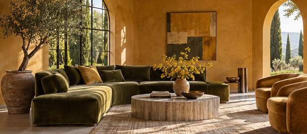
Golden ochre gives a room warmth, especially alongside deep olive upholstery or velvet pillows. If you love thrifted wood furniture and old frames, this combination makes them feel right at home. Add an ivory lampshade for a soft break between the colors.
Want just a little gold? Use ochre on a single cabinet or in the pattern of a rug. Echo it in the artwork, and give olive the larger role.
15. Warm Gray and Muted Coral for a Gentle Pop
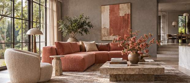
Warm gray walls make a lovely background for muted coral. Look for a soft, earthy coral in pillows, a throw, or a chair. A cream rug and oak table will tie into the gray’s warmer undertone.
IMO, this is one of the easiest palettes to refresh seasonally. Keep a pair of your favorite coral pieces out and swap the smaller accents whenever the room starts to feel too familiar.
How to Choose a Wall Color Combination That Works at Home
The best color schemes for a living room work with the pieces you see every day. Start with whatever would cost the most to replace, whether it’s the sofa, the floor, or the fireplace surround. Then give your palette a quick test before buying paint.
Start With the Light and Furniture You Have
Does your living room look cool even at midday? Try a warm white, sand, or warm beige sample beside a cooler option. In a room that already gets golden afternoon light, dusty blue can give you some balance. Check the paint beside the floor too, where reflections can highlight a different undertone.
Renting or keeping the walls as they are? Build the same palette with a rug, curtains, and two accents at different heights. A coral pillow and a small print with coral in it can connect a gray sofa to the rest of the room.
Test Your Shortlist Before You Buy
- Start with three roles. Use one color on the largest surfaces, a second for upholstery or curtains, and a third for small accents.
- Compare large samples. Paint movable boards and hold them behind the sofa and beside the window. A tiny swatch can hide undertones.
- Check morning and evening. Look at the same samples in daylight and with your usual lamps on. Note which colors get warmer, cooler, or darker.
Pick Your Palette and Give It a Test Run
Warm white and oak can brighten a room, sage and ivory can soften it, and burgundy and blush can give it a richer feel. Save the two combinations you keep coming back to, then test both beside your sofa. Your living room gets the final vote, even if the paint chip looked fabulous at the store.